Project Description
Dwell Real Estate
Branding | Visual Identity | Print
Formerly a part of Remax, Dwell Real Estate Group is a new independent business run by seasoned real estate experts, the Laijas-Cook family, covering the Bexar county and nearby areas. We had the opportunity to help them with their new logo and visual identity as part of this transition.
Because the group already had clients under their old name, part of the challenge was to keep existing, older clients happy while attracting new, younger couples. This was done by taking a classic, yet modern approach to the look and feel of the company that could appeal to audiences young and old.

Business cards.
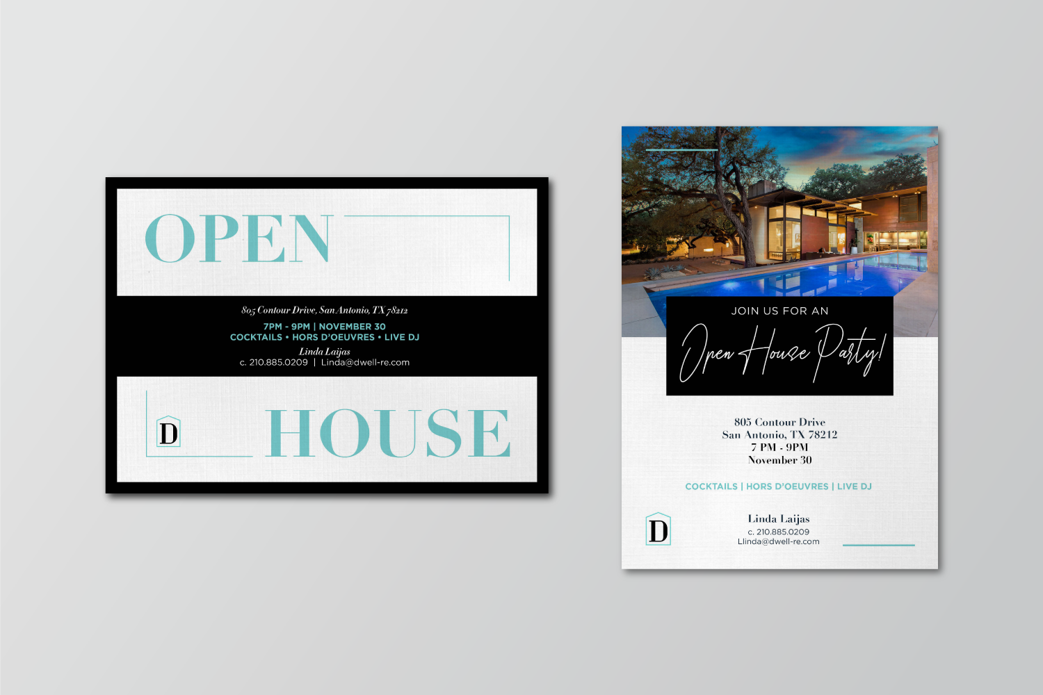
Open House invitations.
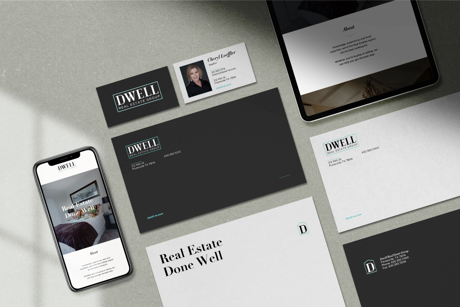
Stationery.
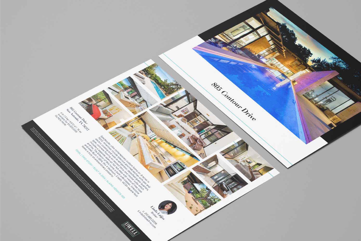
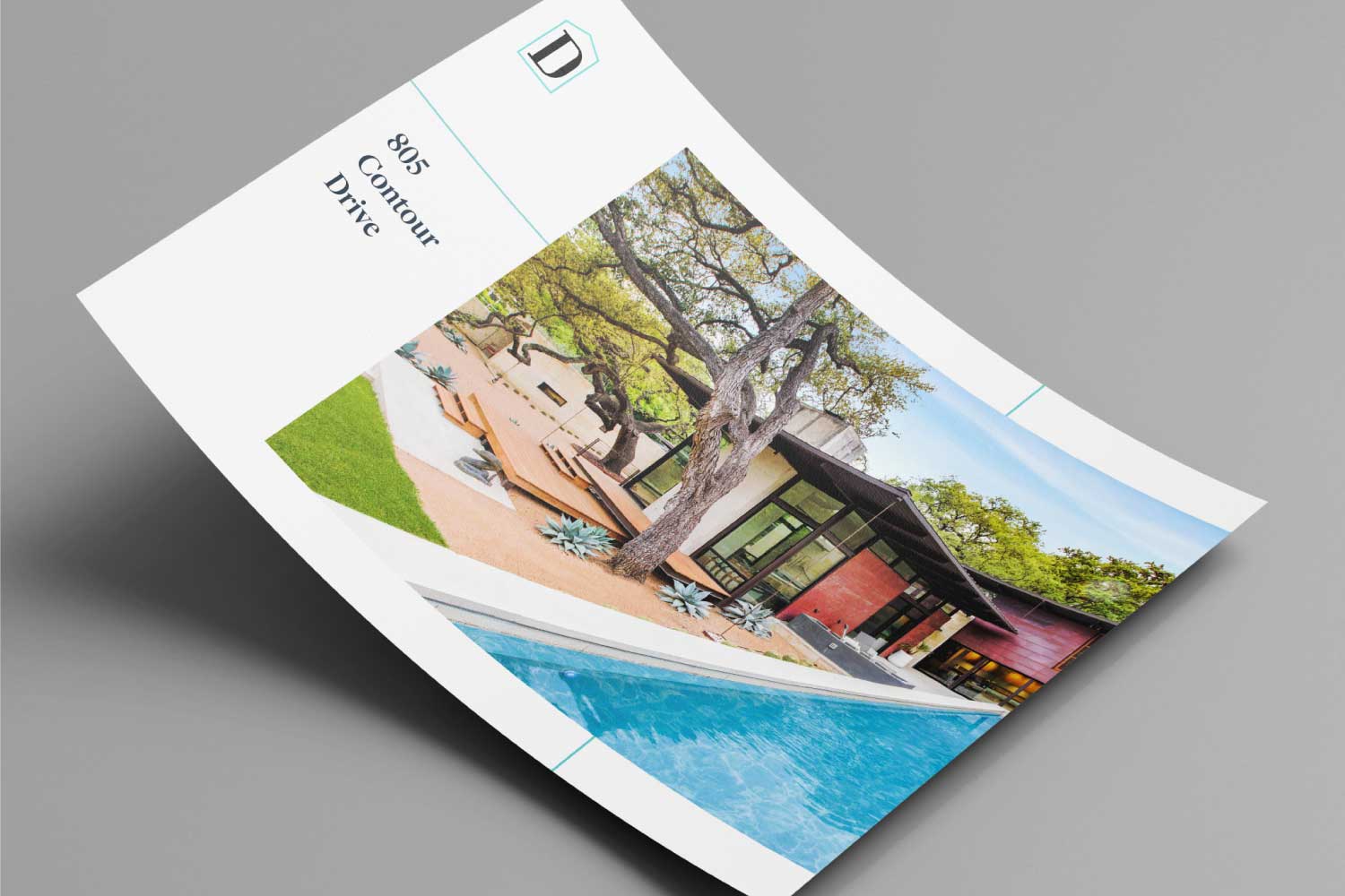
Listing brochures.
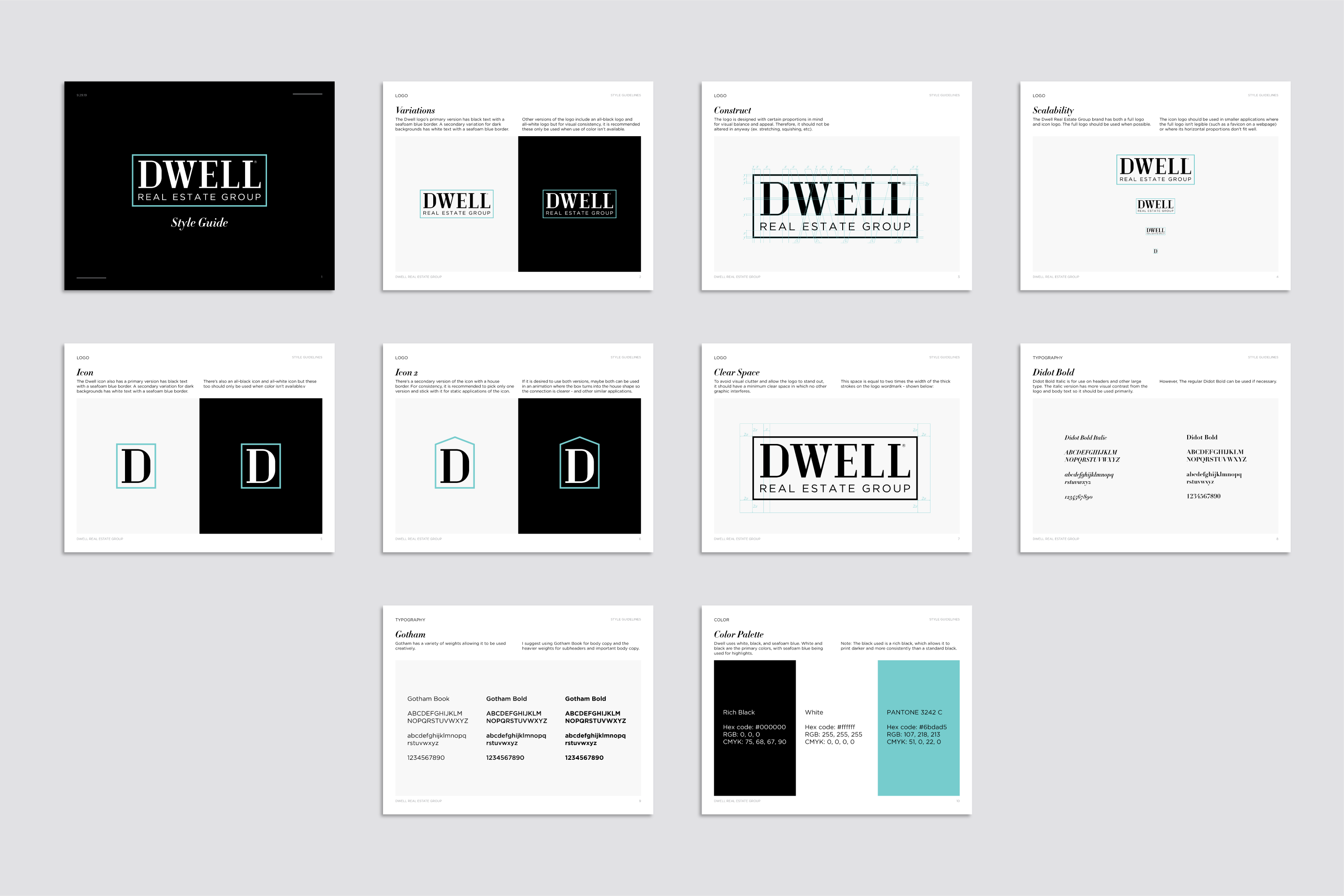
We took a typographic approach to the design, creating a custom typeface that features the use of serifs (for a classic look) with high-contrast strokes and a geometric structure (for visual balance and a modern look).
The surrounding rectangle holds the logo together as one, improving the separation of the logo from information when used on yard signs, and providing an opportunity to use just a bit of color without taking away from the formal black and white aesthetic.
Logo structure grid.